Web Weekly #138 | Stefan Judis Web Development
What features entered cross-browser support last week? Aren’t utility-first classes the same as inline styles? When would you use CSS clip-path?
Turn on the Web Weekly tune and find all the answers below. Enjoy!
Pablo listens to Trent Reznor & Atticus Ross – Challengers: Match Point
This song is part of the trending movie soundtrack “Challengers” and it is composed by Trent Reznor & Atticus Ross, from NIN (Nine Inch Nails). They also made the soundtrack for The Social Network and The Girl with the Dragon Tattoo. I have always loved their music, but I do love more EBM like tracks, such as Match Point or my old favorite one, Closer to God.
Do you want to share your favorite song with the Web Weekly community? Hit reply; there are two more songs left in the queue.
How do you ship great and resilient user experiences when folks use different browsers and devices, are on different network connections, and are distributed globally?
Tricky tricky. So how do you do this? To be on the safe side, you should implement a fundamental working experience and enrich or adapt it to the browser’s capabilities. This approach is called progressive enhancement.
But what are examples of this approach?
View transitions allow you to transition and animate UI state magically. The problem is that they’re not cross-browser supported yet. Luckily, you can treat them as enhancements because delightful animations aren’t required for a working baseline functionality. Of course, it depends on the product, but the web isn’t known for its wonderful UI transitions, so I think it’s fine. 😅
Checking if a browser supports them is a quick one-liner: if(document. If view transitions are available, use them. If not, still ship a well-working and functioning site. Cool! This is progressive enhancement in action, and you can apply it to many other web platform features.
But where do you draw the line? What should be considered the base web platform functionality from which to enrich?
You could go with the official baseline, which makes its way into MDN and web dev lingo by providing information about overall support for specific HTML, CSS and JavaScript features.
But then, should we focus on particular baseline features or consider if HTML, CSS or JavaScript are available first?
Is it a real case to consider a user experience without HTML? I don’t think so. If there’s no HTML, there’s nothing to display. So there’s nothing to enhance.
But thinking of CSS — is CSS an enhancement? Should a site work without it? In my opinion, yes. But hold one Stefan! Nobody visits websites without CSS! Well… the Googlebot parses your HTML. Assistive technology relies on semantic HTML. I do when a website has too long lines, and I’m forced to read articles in reader mode. There’s a case for a good HTML experience.
But then there’s the controversial part: JavaScript. Should sites work without JavaScript?
Andy says it shouldn’t be about ignoring JavaScript. It should be about using the right tool for the job and avoiding using the most fragile solution to build your entire site.
But even when you use JS in the right places, is asking “Does it work without JavaScript?” the right question?
I’ve had this argument over and over again. The loudest counterargument is always, “Nobody uses the web without JavaScript!”. Yeah, that’s fair, but here’s Jim with a phrase that I’ll use from now on.
Does it work before JavaScript? Bam! It’s not about building things that work without JavaScript (even though JS requests could fail or the code could blow up), but it’s about UI that works even when all these curly bytes are still squeezing themselves through the network. That’s it, and I love it!
Beanheads is a gorgeous React component that creates funny avatars. Could someone please wrap it and create an API to fetch random avatars?
If you want to save time in your code reviews, put on your colleague’s hat and review your own PRs. You might be surprised how many things you’ll notice when looking at your changes in a different environment with different eyes. 💯
If you’re working on complex React applications, you should read this series that explains why JavaScript closures can lead to massive memory leaks.
AI is there, and it’s not going away. Does this mean we no longer need to build UIs because everything will be a chatbot? Malte explains why “pure chat” isn’t the answer and why we still need delightful UIs.

Emil explains how to use CSS clip-path with some good eye candy. I’m not the biggest fan of duplicating DOM elements, but it still puts the CSS property more on my radar.
Wowza! Would you enjoy getting Web Weekly straight to your inbox?
Here’s a music player that generates piano music based on the current date and time. Just because, why not?
Utility-first CSS isn’t inline styles
Like many, I was skeptical about going all in with utility-first CSS when it took off. Ages ago, Sarah Dayan convinced me to consider using them.
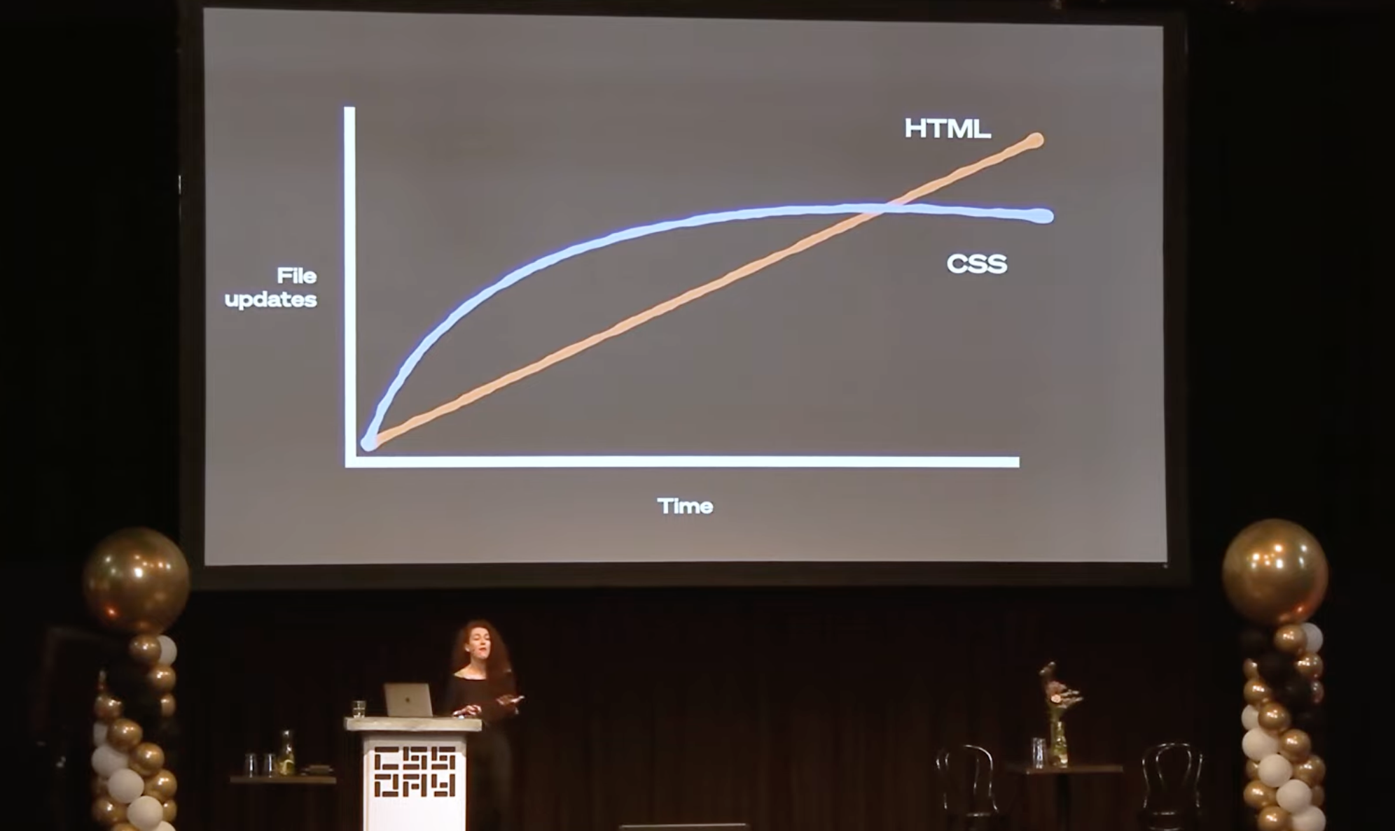
She was back at CSSDay and continued her series of arguments. Highly recommended, when you haven’t taken your stance on the semantic vs utility-first CSS debate.
Single page view transitions work in Chromium and the newest Safari. Chromium even supports multi-page view transitions these days. Bramus cleared some common misconceptions about them.
The biggest one: yes — you can safely use view transitions today. Go ahead and add some sparkles to your sites. ✨
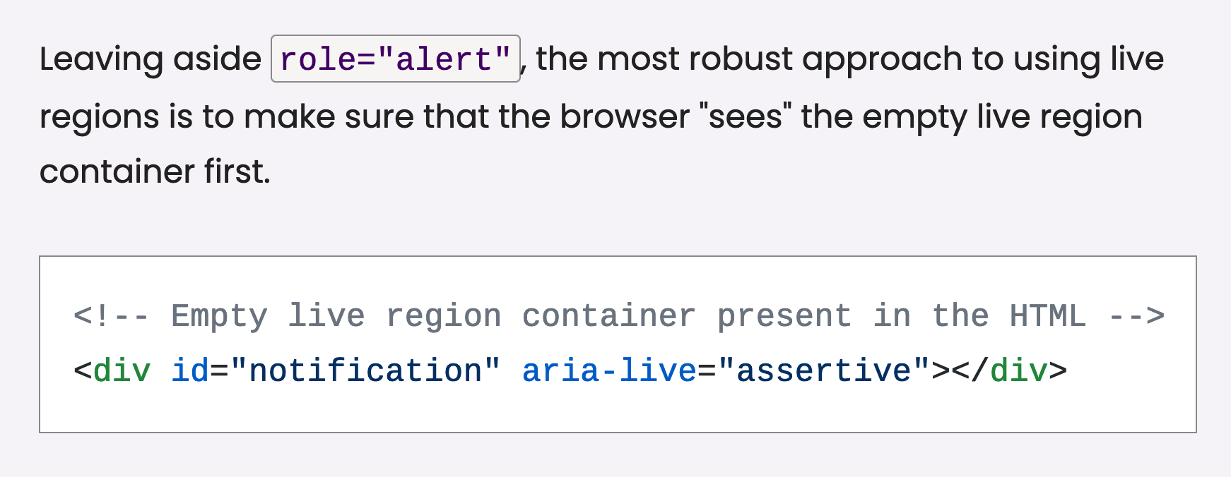
If you implement toast notifications in your apps, you should also make them accessible via an ARIA live-region. Patrick has you covered if you are wondering how to implement live regions correctly so they’ll work across browser screen reader combinations.
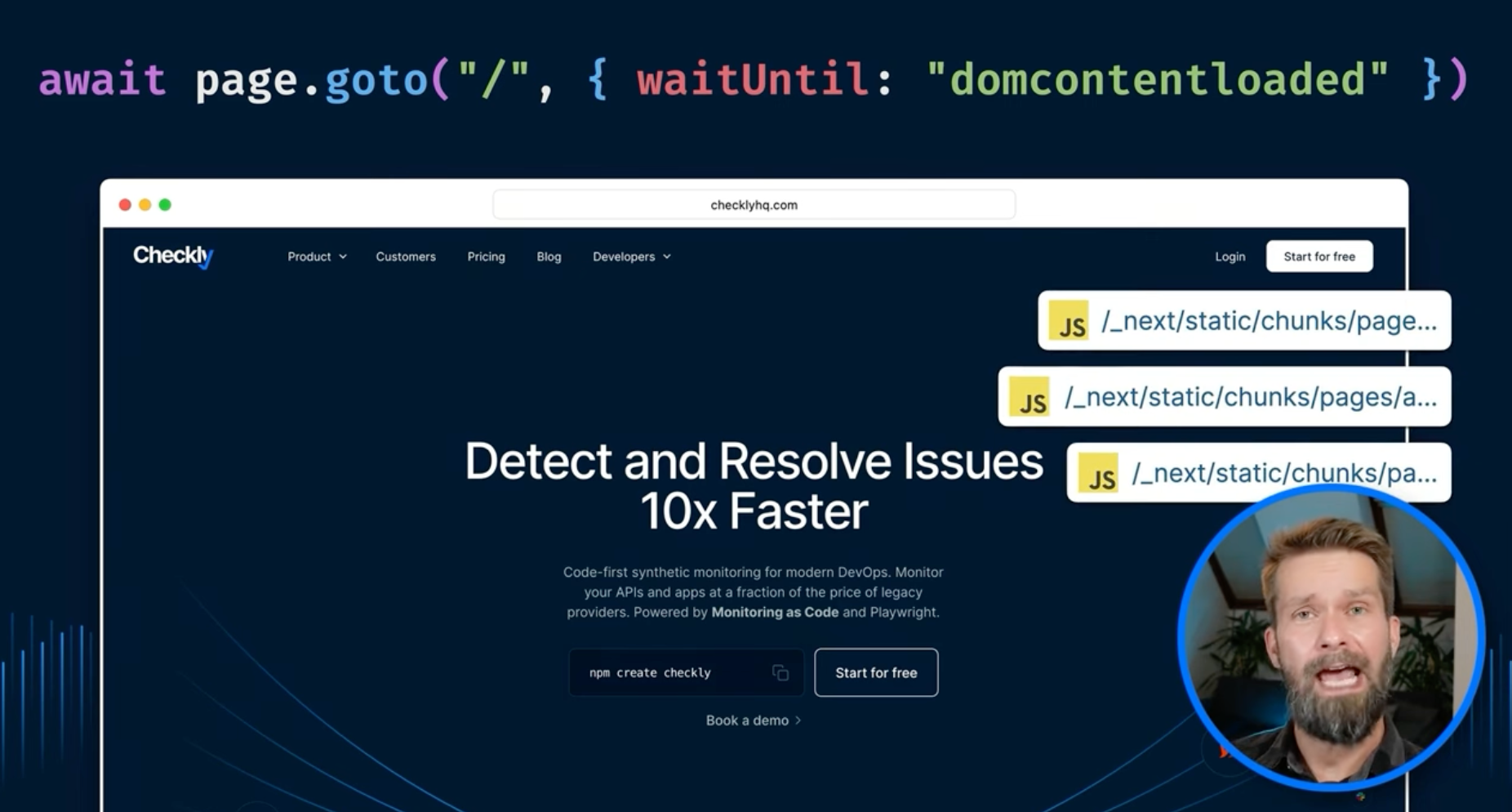
I’m back in the video game: if you’re end-to-end testing your sites with Playwright, speed up your tests with a tiny page tweak.
From the unlimited MDN knowledge archive…
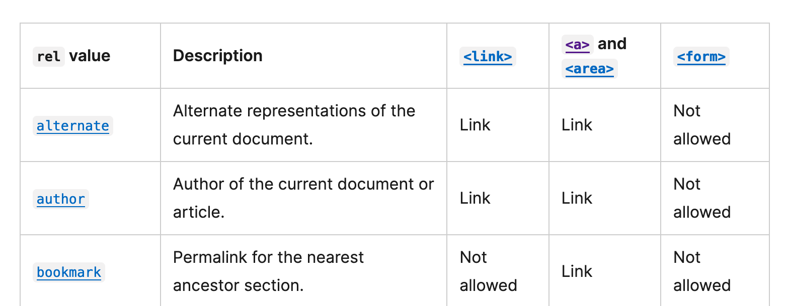
Do you know that there are almost 30 specified rel values?
No? As always, MDN has you covered.
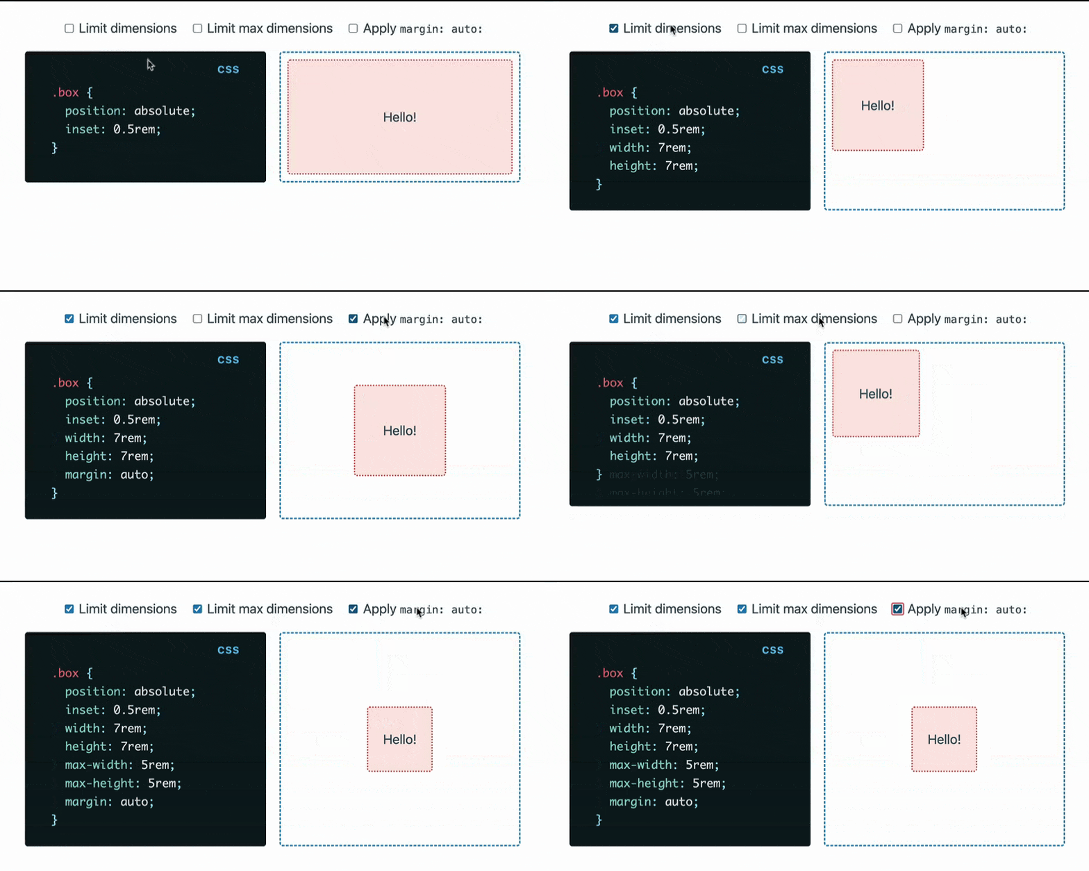
Are you ready for my favorite learned CSS trick from this year? Apply margin: auto to absolutely positioned elements to center them.
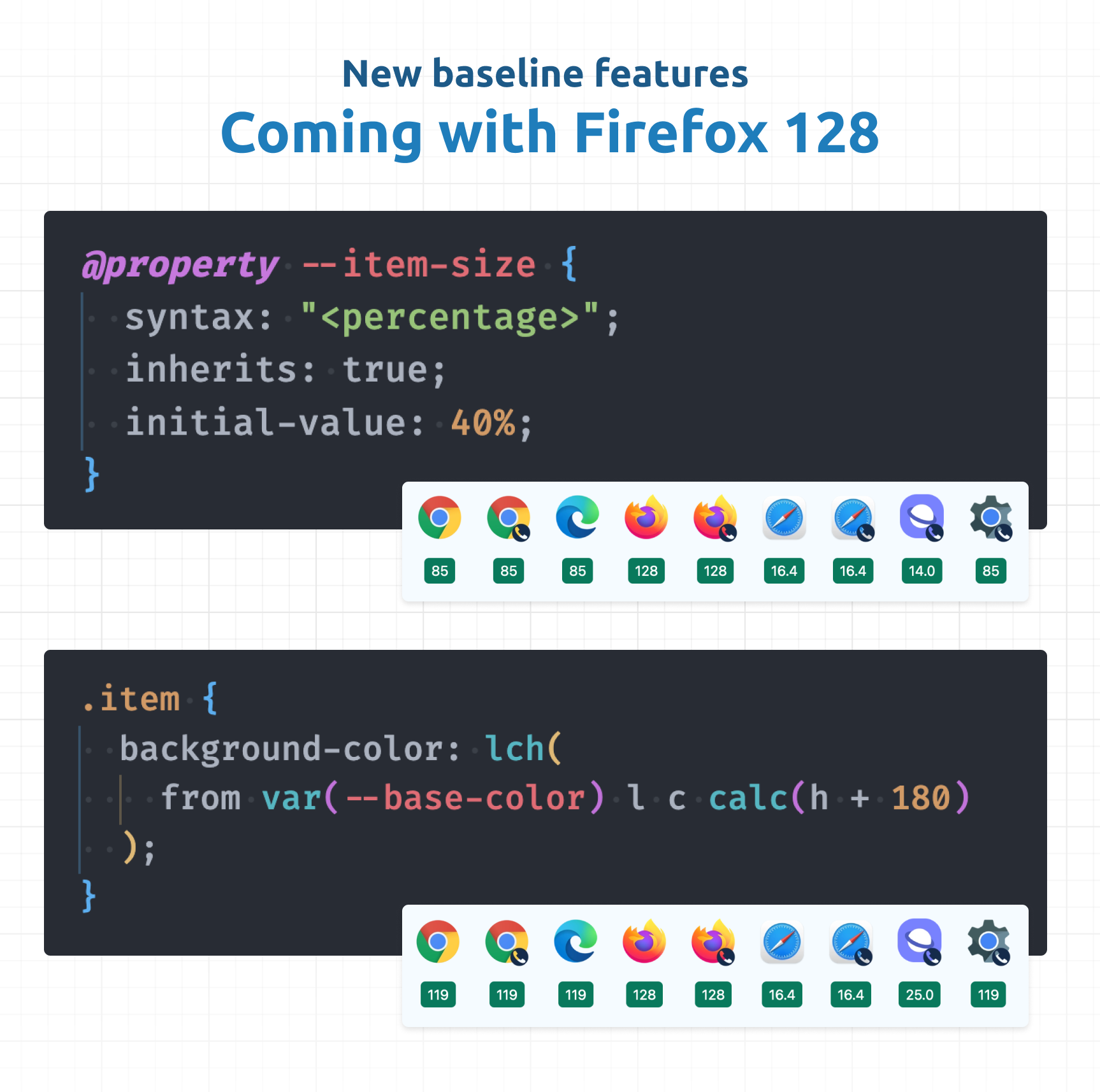
Firefox 128 shipped last week, and two new CSS features entered the baseline: @property and relative color syntax.
@property allows you to add type safety to your custom properties, and it’s now possible to animate them. If you want to learn more, Una explains why you want to use @property.
The relative color syntax, on the other hand, lets you manipulate colors and even create entire color palettes right in CSS. Learn more about relative colors on the blog.
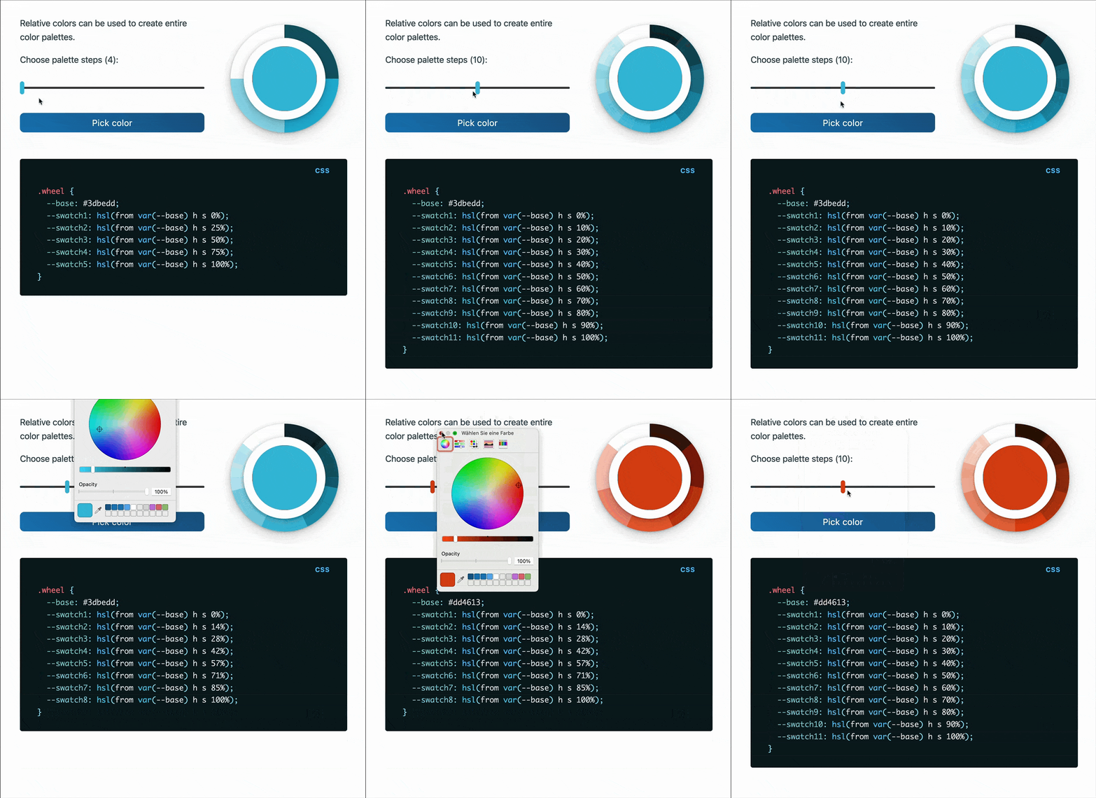
And while you probably want to wait a few browser releases until you use these new features because they’re hard to polyfill, now’s the time to start looking into them.
If you want to feature detect @property, Bramus explains how to do it. Unfortunately, it doesn’t really help for the Firefox case because the feature detection relies on style queries that Firefox doesn’t support.
- Raycast has been my command launcher and overall Swiss army knife for everything for quite a while now, and I can wholeheartedly recommend it. If you consider going on the pro plan, get 10% off with this link.
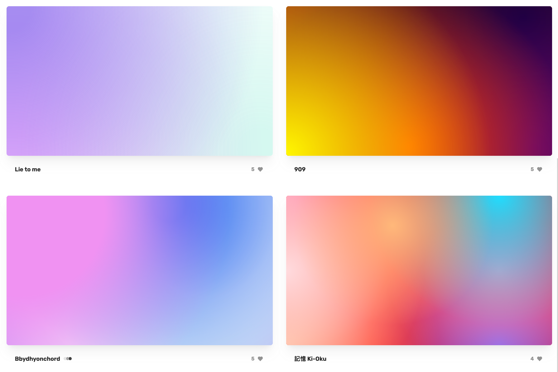
If you’re looking for beautiful CSS-only mesh gradients, I’m sure you’ll find one on MSHR. 💯👇
If you’ve subscribed for a while, you’ve probably noticed that I’m skeptical of our JS-first world. But there’s a change happening in the apps we’re shipping.
Here’s Ryan Florence (React Router and Remix) explaining React’s push for server components and the new approaches, and we’re finally heading in the right direction.
In the best apps you’ll never notice the network.
It’s still questionable if all this complexity is needed, but hey — I take a better user experience for now.
If so, join 13 other Web Weekly readers and give back with a small monthly donation.
💙 A big thanks goes to Paul and Martin, who recently started supporting Web Weekly!
Loved this email? Hated this email? I want to hear about it!
If you think something needs improvement or something sparked some joy, reply to this email because I want to know more!
And with that, take care of yourself – mentally, physically, and emotionally.
I’ll see you next week! 👋


